
css
对 MDN web docs 中css的学习的个人总结.
base
css 的基本语法如下:
h1 {
  color: red;
  font-size: 5em;
}
h1是 selector,即我们想要修改样式的 html element,大括号里面是一对对property和value(css declaration),用以对 element 的某个特性进行修改
selector 和 css declaration 和大括号一起被叫做 css rulesets
css 中有很多可以修改property,它们被分为一个个modules用以区分,这在命名中有所体现(如background-color).
css 的 value 也可以是函数:
.outer {
  border: 5px solid black;
}

.box {
  padding: 10px;
  width: calc(90% - 30px);
  background-color: rebeccapurple;
  color: white;
}
这个会设置宽度为%90,最小 30px
想修改多个的话:
p,
li {
  color: green;
}
浏览器一般会给 element 一些默认样式,我们可以修改或关闭这些样式:
li {
  list-style-type: none;
}
当我们修改的不是特定的 element,而是经过 class 指定的 element 时:
.special {
  color: orange;
  font-weight: bold;
}
这样就可以修改所有 class 为 special 的 element 了
我们还可以指定某一类 element 中的 class:
li.special {
  color: orange;
  font-weight: bold;
}
这样只会修改 li 中的 special
我们还可以通过 element 的相对位置来修改 element:
li em {
  color: rebeccapurple;
}
这个会修改在 li 中的em(descendant combinator)
h1 + p {
  font-size: 200%;
}
这个会修改在紧跟在 h1 后的p(adjacent sibling combinator)
一个 element 通常有不同的state(如链接被点击时,鼠标悬停时),css 也可以指定state来修改样式:
a:link {
  color: pink;
}

a:visited {
  color: green;
}
selector和combinator可以按上面的方式杂在一起使用:
body h1 + p .special {
  color: yellow;
  background-color: black;
  padding: 5px;
}
css 的使用有三种方式:
External stylesheet:
<link rel="stylesheet" href="styles/style.css" />
Internal stylesheet(放在 head 中):
<style>
  h1 {
    color: blue;
    background-color: yellow;
    border: 1px solid black;
  }

  p {
    color: red;
  }
</style>
Inline styles(需避免使用):
<h1 style="color: blue;background-color: yellow;border: 1px solid black;">
  Hello World!
</h1>
当对同个 element 有多个可应用的 stylesheet 时,有一定规则:
p {
  color: red;
}

p {
  color: blue;
}
这个后面那个会应用,css 会应用后有作用的
.special {
  color: red;
}

p {
  color: blue;
}
前面那个会应用,因为前面的specificity较高
@rules用于设置 css 的应用规则,如:
@import "styles2.css";
它引入了另一个 css 文件
body {
  background-color: pink;
}

@media (min-width: 30em) {
  body {
    background-color: blue;
  }
}
这个会在宽度满足条件时设置 body 的背景色
有些properties可以在一行设置多个 value,被称为shorthand properties:
/* In 4-value shorthands like padding and margin, the values are applied
   in the order top, right, bottom, left (clockwise from the top). There are also other
   shorthand types, for example 2-value shorthands, which set padding/margin
   for top/bottom, then left/right */
padding: 10px 15px 15px 5px;
如果后面的没有设置值,那它就是默认值
同时我们也看到了 css 的注释如何写,和 c++的注释一样
css 中的空格一样和 html 会被忽略,但注意不要给properties和value的中间加空格
cascade and inheritance
cascade指 css 应用规则的规则,上面已经有简单的介绍(后到优先,specificity 高优秀),
cascade会按如下顺序应用(降序):
- Source order
- Specificity
- Importance
specificity的计算较为复杂,基本的逻辑是每个 selector 有一个数量级的 specificity,将某个 ruleset 里面的 specificity 相加得到整个的 specificity,高的会被使用,但如果相差一个数量级,即使累计值更高,仍是高数量级的先应用.
| 数量级 | selector |
|---|---|
| thousands | inline style(<style>) |
| hundreds | ID selector |
| tens | class attribute pseudo-class |
| ones | element pseudo-element |
其他如 combinators 对值无影响.
如h1 + p::first-letter,它的specificity为 0003(三个 ones)
如果我们想让某个property直接是最特殊的,使用!important:
.better {
  background-color: gray;
  border: none !important;
}
这样就会直接应用它了,但应该尽量避免使用
有矛盾的 declaration 的应用顺序如下:
- Declarations in user agent style sheets (e.g. the browser's default styles, used when no other styling is set).
- Normal declarations in user style sheets (custom styles set by a user).
- Normal declarations in author style sheets (these are the styles set by us, the web developers).
- Important declarations in author style sheets
- Important declarations in user style sheets
inheritance则是指有些父element的性质会被继承到子element中,只有重新设置才会改变有些不会.
会不会继承一般和常识相符,如像 widths , margins, padding, and borders 都不会继承.
我们使用四个特殊的值来控制继承:
| --- | 功能 |
|---|---|
| inherit | 打开继承 |
| initial | 将值设为初始值 |
| unset | 将值设为为进行设置时的值(有时初始有时继承) |
| revert | 将值设为浏览器的默认样式 |
例子:
.my-class-1 a {
  color: inherit;
}
有时我们会将上述特殊值用在 shorthand property all上,对改element的所有 properties 应用:
.fix-this {
  all: unset;
}
selector
接下来对 selector 进行深入的了解
type class id
type
h1 { }
universal selector
* {
  margin: 0;
}
它会对整个文档起作用(或某个element中的所有元素),有时它还会被使用来增加可读性(如用article *:first-child代替article :first-child避免和article:first-child混淆)
class:
.box { }
如果我们希望选中多个 class 的组合:
.notebox {
  border: 4px solid #666;
  padding: 0.5em;
}

.notebox.warning {
  border-color: orange;
  font-weight: bold;
}

.notebox.danger {
  border-color: red;
  font-weight: bold;
}
这样下面那两行只有在跟 class="notebox danger"`类似的情况才能使用
ID:
#unique { }
h1#heading {
    color: rebeccapurple;
}
它每页文档只能被使用一次
attribute
Attribute selectors
| Selector | Example | Description | | :-------------- | :------------------------------ | :--------------------------------------- | ------- | ---------------------------------------------- | | [attr] | a[title] | 匹配有该 attribute 的 | | [attr=value] | a[href="https://example.com"] | 匹配有该 attribute 的且值也匹配的 | | *attr~=value] | p[class~="special"] | 匹配有该 attribute 的且值中有对应的值的 | | [attr | =value] | div[lang | ="zh"] | 匹配有该 attribute 的且以值为里头的值加-开头的 | | [attr^=value] | li[class^="box-"] | 匹配有该 attribute 的且以值 value 开头的 | | [attr$=value] | li[class$="-box"] | 匹配有该 attribute 的且以值 value 结尾的 | | [attr*=value] | li[class*="box"] | 匹配有该 attribute 的且以值含有 value 的 |
如果我们相要让值的选中区分大小写,使用i(li[class^="a" i] )
pseudo-class(选择特定的 state),它工作就像加了特定的 class
a:hover { }
pseudo-elements(选定 element 的一部分),就像加了一个 element
p::first-line { }
我们有时会用它的::before,::after来使用 css 插入内容到网页中:
.box::before {
  content: "This should show before the other content.";
}
一般不用于插入文字,而是插入 icon,或者插入一个空格后像编辑一个正常的 element 一样编辑:
.box::before {
  content: "";
  display: block;
  width: 100px;
  height: 100px;
  background-color: rebeccapurple;
  border: 1px solid black;
}
combinators
descendant combinator
article p { }
选择第一个的子 element 中的第二个,注意是所有子 element
child combinator
article > p
选择第一个的直接子 element 中的对应 element,即只选择第一层的子 element
adjacent sibling combinator
p + img
选择与第一个直接相邻的第二个类型的 element
general sibling combinator
p ~ img
选择与第一个相邻的第二个类型的 element,即使不直接相邻也会起作用.
实际使用时,我们尽量不要使用太复杂的 selector,对复用性和可读性等都有一定的损害.
box model
一个 html element 可以看作被放在一个box中:
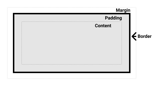
box 初略来说可以分为两种:
block box
1.出现在新行
2.在行的位置会拓展延申占据所有可占据的空间
3.可使用 width,height
4.Padding, margin and border 会导致其他 element 被推开
inline box
1.不出现在新行
2.不可使用 width,height
3.Padding, margin and border 只会导致水平方向其他 element 被推开
它们都有被定义成 outer display type(inner 改变的是 element 元素里的元素摆放):
.inline {
  display: inline;
}
有时我们想要 element 可以占据独立的空间,又不想换行,还可以使用:
span {
  display: inline-block;
}
这样就会在不换行的情况下支持长宽修改,且修改相应 property 会推开其他 element
默认使用 standard css box model,此时改变 width 和 height 改变的是 content box 的属性,但这样计算整个 box 的大小需要加上 padding,border 的大小,上下左右都要(注意 margin 不被算在其中).我们可以使用 alternative css box model,此时 width 等就修改的是整个 box 的大小,content 的大小会由这个的大小减去 padding,border 的大小得到:
.box {
  box-sizing: border-box;
}
对整个 html 文件应用:
html {
  box-sizing: border-box;
}
*,
*::before,
*::after {
  box-sizing: inherit;
}
margin 可通过直接的 shorthand property 修改,也可通过加-修改 top,left 等具体位置,它的值可正可负:
.box {
  margin-top: -40px;
  margin-right: 30px;
  margin-bottom: 40px;
  margin-left: 4em;
}
margin 的一个重要概念是 margin collapsing.当两个 elements 的 margin 相遇时,它们会融合到一起.当它们的值都为正时,去较大的那个.当一正一负时,正-负得到最终的值,当全为负时,去最小的负值.
border同样有对应的 shorthand property 和具体的 property,border 还可以修改 width,style 和 color:
.container {
  border-top: 5px dotted green;
  border-right: 1px solid black;
  border-bottom: 20px double rgb(23, 45, 145);
}

.box {
  border: 1px solid #333333;
  border-top-style: dotted;
  border-right-width: 20px;
  border-bottom-color: hotpink;
  border-bottom-height: 20px;
}
padding和margin类似,不同的是它没有 collapsing,值只能为 0 或正值.
background and borders
background-color:
.box {
  background-color: green;
}
span {
  background-color: rgba(255, 255, 255, 0.5);
}
改变 content and padding box 的背景颜色
background-image:
.a {
  background-image: url(balloons.jpg);
}
添加背景图片,如果图片较大则默认只显示一部分,图片较小则默认会重复以填满背景.图片会在显示颜色之上.
当图片较小时,我们可以指定如何重复:
.box {
  background-image: url(star.png);
  background-repeat: repeat-y;
}
repeat-x在水平方向重复,repeat-y在垂直方向,repeat是默认值,在两个方向都重复;no-repeat为不重复.
当图片较大时,我们可以修改它的尺寸:
.box {
  background-image: url(balloons.jpg);
  background-size: cover;
}
background-size可以带两个值(length or percentage)来指定长宽,或者为cover(保证长宽比的同时填满背景,图片可能有一部分不显示)或contain(保证长宽比的同时尽量填满背景,背景可能有一部分空缺).
我们还可以通过background-position来修改背景图片的位置,它一般带两个值,默认为(0,0)
我们可以使用如top等的值:
.box {
  background-image: url(star.png);
  background-repeat: no-repeat;
  background-position: top center;
}
我们也可以使用长度比例来指定:
.box {
  background-image: url(star.png);
  background-repeat: no-repeat;
  background-position: 20px 10%;
}
它们可以被混着使用,但这样第一个必须表示水平方向,第二个必须表示垂直方向:
.box {
  background-image: url(star.png);
  background-repeat: no-repeat;
  background-position: 20px top;
}
我们还可以使用四个值:
.box {
  background-image: url(star.png);
  background-repeat: no-repeat;
  background-position: top 20px right 10px;
}
这样它会相对于 top 偏移 20px,相对于 right 偏移 10px
我们还可以使用渐变来做背景:
.a {
  background-image: linear-gradient(
    105deg,
    rgba(0, 249, 255, 1) 39%,
    rgba(51, 56, 57, 1) 96%
  );
}
我们可以插入多张图片(逗号分割)做背景:
.a {
  background-image: url(image1.png), url(image2.png), url(image3.png),
    url(image4.png);
  background-repeat: no-repeat, repeat-x, repeat;
  background-position: 10px 20px, top right;
}
第一个图片会显示在最上层,以此类推.
当下面如background-repeat等的数目小于背景图的数目时,我们会重复应用那些值(如在 repeat 后使用 no-repeat,如何是 repeat-x).
我们使用background-attachment来控制背景图片和页面滚动的关系,当值为scroll时,它会跟着页面滚动,当为fixed时,它不会跟着页面滚动,一直固定,且会填满整个元素(当日相应的 element 消失后也会消失),当为local时,它不仅跟页面滚动,元素内滚动也会滚动.
我们使用background这个 shorthand property 来简便地修改背景,只需要注意几点:
1.逗号分隔值.
2.颜色的值放最后.
3.position 和 size 需相应,写成如 center/80%的形式
border同样有对应的 shorthand property 和具体的 property,border 还可以修改 width,style 和 color(注意设置 width 不设置 style 不会显示 border):
.box {
  background-color: #567895;
  border: 5px solid #0b385f;
  border-bottom-style: dashed;
  color: #fff;
}
border还可以修改边角的圆角值,有两个长度比例值,分别为水平垂直的对应值,如果只写一个则会被应用到两个中去:
.box {
  border-radius: 10px;
}
.box {
  border-top-right-radius: 1em 10%;
}
text direction
文本的方向被叫做writing-mode,有三个值:
horizontal-tb: Top-to-bottom block flow direction. Sentences run horizontally.vertical-rl: Right-to-left block flow direction. Sentences run vertically.vertical-lr: Left-to-right block flow direction. Sentences run vertically.
默认是第一个.
当修改这个时,block 和 inline 的方向也会被修改,此时再使用如 width,top 等会出现问题,故此时我们可以使用 logic properties and values:
width → inline-size
height → block-size
margin-top → margin-block-start
默认 block 的方向是垂直,inline 的方向是水平,对应着修改即可.
这是新出的标准添加的,改变writing mode尽量使用避免出错.
overflowing content
有时内容会 overflow,即 box 太小不足放下内容,内容跑到 box 外面了。
css 默认会让 overflow 可视化以避免数据顺势,外面可以通过overflow来进行控制:
.box {
  border: 1px solid #333333;
  width: 200px;
  height: 100px;
  overflow: hidden;
}
这样 overflow 的内容就会被隐藏了.
外面还可以添加滚动条:
.box {
  border: 1px solid #333333;
  width: 200px;
  height: 100px;
  overflow: scroll;
}
这样用户可以通过滚动条看到 overflow 的内容了.
overflow 是可带两个值,一个给overflow-x,一个给overflow-y,当日也可以单独设置它们:
.box {
  border: 1px solid #333333;
  width: 200px;
  height: 100px;
  overflow-y: scroll;
}
这样只会在 y 方向显示滚动条
在 x 方向自然也可以,但如果是因为字太大导致 overflow,不推荐用此种方式解决.
外面还可以让浏览器根据内容决定是否显示滚动条:
.box {
  border: 1px solid #333333;
  width: 200px;
  height: 100px;
  overflow: auto;
}
如果使用了auto或scroll,我们说我们建立了block formatting context,即内容不可超过 box,且有滚动条控制内容.
values and units
css 中的value type指一类值的集合.
| Data type | Description |
|---|---|
<integer> | 整数 |
<number> | 十进制小数 |
<dimension> | <number>加单位,包括<length>,<angle>,<time>,<resolution> |
<percentage> | 相对于其他值的百分比. |
<length>的单位有绝对和相对,绝对单位大部分多用于打印,我们一般只用px(pixel),相对单位如下:
| Unit | Relative to |
|---|---|
em | Font size of the parent, in the case of typographical properties like font-size, and font size of the element itself, in the case of other properties like width. |
ex | x-height of the element's font. |
ch | The advance measure (width) of the glyph "0" of the element's font. |
rem | Font size of the root element. |
lh | Line height of the element. |
vw | 1% of the viewport's width. |
vh | 1% of the viewport's height. |
vmin | 1% of the viewport's smaller dimension. |
vmax | 1% of the viewport's larger dimension. |
其中 viewport 指浏览器的视窗大小.
percentage一般是指占该 element 的父 element 对应值的百分比.
一个用<number>的例子是opacity(控制不透明度),值在 0-1 之间.
<color>可用 keyword 如 red,blue,也可以用十六进制数代表 rgb 值,如#02798b,还可以用函数:
.one {
  background-color: rgb(2, 121, 139);
}
控制 rgb 值还有 rgba()这个函数,最后的参数控制不透明度(0-1).
还有其他颜色标准的函数如 hsl.
<image>表示可以用图片作为值,一般用url()函数加上地址来使用.
<position>表示 2d 坐标,可带两个坐标值,也可使用top, left, bottom, right, and center这些 keywords,还可以使用 keyword 加<length>表示偏移值(key,num,key,num).
上面提到的 keywords 被称为identifiers,可不带",如果要使用正常的 string 的话,腰带''.
function 还有一个calc()可用于进行数学计算:
.box {
  width: calc(20% + 100px);
}
sizing items
一般一个 element 会有一个intrinsic size,即内在大小(<div>根据内容自动生成此大小,若无内容则无).当我们通过如width等修改大小后,修改完的大小叫extrinsic size,即外来的大小.
当我们使用百分比时,一般都会是父 element 相应的 property 的值的大小,但margin和padding的大小会是该 box 的inline size的大小.
我们还可以指定最大最小大小(如max-height),指定最大通常是为了让图片不会超出视界,此时图片会等比例缩放.当注意,不要用这样的方法将大图片缩放来使用,这样会让网站加载变慢,还会浪费用户的带宽.
我们有时也使用viewport(即浏览器显示网站区域)的大小来修改大小,具体看上面 values 里的介绍.
image media and form element
image,video 都属于replaced element,css 不可影响它们的 internal layout.
当它们太大时,我们可以利用max-width来控制它们在 box 中:
img {
  max-width: 100%;
}
也可以使用object-fit,它有 contain(保持比例尽量填满 box,可能填不满),cover(保持比例填满 box,可能一部分确实),fill(填满 box,不保持比例)等值.
它们在 layout 中有不同的初始行为.
对于 form element 修改如下:
input[type="text"],
input[type="email"] {
  border: 2px solid #000;
  margin: 0 0 1em 0;
  padding: 10px;
  width: 100%;
}
styling table
首先添加一些空间,处理 layout:
/* spacing */

table {
  table-layout: fixed;
  width: 100%;
  border-collapse: collapse;
  border: 3px solid purple;
}

thead th:nth-child(1) {
  width: 30%;
}

thead th:nth-child(2) {
  width: 20%;
}

thead th:nth-child(3) {
  width: 15%;
}

thead th:nth-child(4) {
  width: 35%;
}

th,
td {
  padding: 20px;
}
table-layout: fixed可让列的大小由 headings 的大小决定,而不是根据内容决定,这样可让 table 的大小更可预测,控制.
thead th:nth-child(4)用于处理第 n 个 heading 的大小,用比例以便适配不同大小的 viewport.
border-collapse: collapse;让里头的表格的 border 之间不会有多余的空白.
最后添加了一定 padding 让表格不那么紧凑,便于阅读.
关于里面的内容,可以添加字体来美化,同时最后将td等的text-align进行调整以和 heading 对齐.
我们可以通过添加斑马线让不同的行可读性更高:
/* zebra striping */

tbody tr:nth-child(odd) {
  background-color: #ff33cc;
}

tbody tr:nth-child(even) {
  background-color: #e495e4;
}

tbody tr {
  background-image: url(noise.png);
}

table {
  background-color: #ff33cc;
}
nth-child支持表达式如 2n,even 等 keyword 跟填入相应的表达式起同样的作用
对于 caption,需要知道的是我们还可以通过caption-side: bottom;,调整 captain 的位置,如调到下方.
text and font styling
对于字的美化,css 中的 properties 大致可分为两类:
字体的 style
ltext ayout 的 style
font
首先显而易见的是我们可以用color来修改字的颜色.
我们也可以通过font-family来修改字体类型:
p {
  font-family: arial;
}
它可以带多个值(逗号分隔),浏览器只使用一个,它会从头开始一个个查看是否支持,支持就使用,如果都不支持就使用浏览器的默认字体.
web safe fonts指一类在大部分的计算机系统都受支持的字体,推荐使用这些字体.
css 定义了五个一般的名字给字体:
| Term | Definition |
|---|---|
serif | Fonts that have serifs (the flourishes and other small details you see at the ends of the strokes in some typefaces) |
sans-serif | Fonts that don't have serifs. |
monospace | Fonts where every character has the same width, typically used in code listings. |
cursive | Fonts that are intended to emulate handwriting, with flowing, connected strokes. |
fantasy | Fonts that are intended to be decorative. |
在font-family的最后一般要带一个上面的字体保证有字体可用.
p {
  font-family: "Trebuchet MS", Verdana, sans-serif;
}
注意如果字体名字有多个词,要加双引号.
我们使用font-size来控制字体的大小.为了方便控制,我们一般会将html的该 property 设为 10px 以便使用rem.
font-style用于控制斜体字是否开启,很少使用.它有三个值,normal 是关闭,italic 是开启,oblique 是将字体倾斜得到一个类斜体.
font-weight用于控制字体的宽度.它有很多值,但除了 normal 正常字体,bold 加粗外,其他很少使用.其他还需要了解的值有 lighter,bolder,用于减少或增加加粗效果,还可用 100-900 的值控制加粗效果.
text-transform用于控制文本的转换,值有:
none: 不转换uppercase:全大写.lowercase: 全小写.capitalize: 首字母大写.full-width: 所有字站一个固定大小的格,效果类似 monospace font.
text-decoration用于控制对文字的修饰,值如下:
none: 无效果.underline:下划线.overline: 上划线.line-through:删除线.
它可以带多个值,应用多个效果,也可以作为 text-decoration-line, text-decoration-style, and text-decoration-color的 shorthand property.
text-shadow用于控制字的阴影:
text-shadow: 4px 4px 5px red;
它的第一个值是阴影的水平偏移,正向右负向左.
第二个值是垂直偏移,除偏移方向变上下外其他和第一个相同.
第三个是 blur radius,值越高阴影越发散.
第四个是阴影颜色.
我们可以对文本添加多个阴影(逗号分隔):
h1 {
  text-shadow: 1px 1px 1px red, 2px 2px 1px red;
}
text layout
text-align用于控制文本摆放位置,值如下:
left: 摆放在左.right: 摆放在右.center: 摆放在中间.justify: 自适应让所有行的宽度一致,谨慎使用.
line-height用于控制每行的高度,它的值可以是带单位的数,也可以是不带单位的数,不带单位的数代表该数乘以字体大小的值,它更被推荐使用.
p {
  line-height: 1.6;
}
一般取 1.5-2.
letter-spacing和word-spacing用于控制字和单词之间的间距:
p::first-line {
  letter-spacing: 4px;
  word-spacing: 4px;
}
css 还有一个 shorthand properties,font,它必须按font-style, font-variant, font-weight, font-stretch, font-size, line-height, font-family的顺序来放值.
在使用时,只有font-size和font-family是必须的.
font-size和line-height之间需要加/.
例子如下:
p {
  font: italic normal bold normal 3em/1.5 Helvetica, Arial, sans-serif;
}
styling list
处理 list 相关的空白,我们需要让 list 的上下空与环绕它的元素一致(vertical rhyme),我们同样需要让它们的内部水平间隔也一致(如控制字的大小).
我们还需要知道三个 property:
list-style-type: 改变每个 li 的头的形状,也可让它不显示.list-style-position:改变 bullet 的位置,让它在表外(outside)或表内(inside),如果在表内则内容换行不会自动空出 bullet 的空间.list-style-image: 用图片做 bullet,不推荐使用,更推荐如下的用法:
ul {
  padding-left: 2rem;
  list-style-type: none;
}

ul li {
  padding-left: 2rem;
  background-image: url(star.svg);
  background-position: 0 0;
  background-size: 1.6rem 1.6rem;
  background-repeat: no-repeat;
}
这样可以用 background 的相关 properties 进行更多的控制.
关于 list style 有一个 shorthand propertylist-style,它就是上面三个 property 的集合,可以使用一个或多个.如果同时使用了图片和形状,则形状只会在图片失效时被使用.
styling linking
首先了解一下 link 的各种状态:
- Link: 有目的地的 link.
- Visited:已经被访问过的 link.
- Focus: focus 在 link 上时.
- Hover: 鼠标放在 link 上时.
- Active: 当用户使用 link 进行跳转时.
默认情况下,link 会:
- 有下划线
- 未访问为蓝色.
- 访问后为紫色.
- 鼠标放在上面时会改变形状.
- foucus 时边上会有一圈 outline(类似边框,但不占页面位置).
- 被使用跳转时呈红色.
我们不能让我们的 link 和默认差得太远,只是要让 link 本身显眼,而且在不同状态下有不同的样式以便区分.
我们通过如下三个 properties 来修改默认样式:
写 css 时需严格按如下顺序(不然会不起作用):
a {
}

a:link {
}

a:visited {
}

a:focus {
}

a:hover {
}

a:active {
}
有时我们会用修改 border-bottom 来制造类似下划线的效果,这样做的好处是更多变且不会和字重叠.
我们有时也为 link 添加 icon 来区分不同的 link:
a[href*="#"] {
  background: url("external-link-52.png") no-repeat 100% 0;
  background-size: 16px 16px;
  padding-right: 19px;
}
注意padding-right,这样就不会和内容重叠了,且上面也把图片设到了最右边,同样为了不和内容重叠.
我们还经常把 link 做成一个个按钮,并弄成无序表,此时我们会遇到不同的 li 之间有多出的空白的问题(inline block 的问题).此时可以通过把 margin 设为负等方法解决.
web fonts
web fonts 即我们可以通过提供字体文件供用户下载来使得字体可用.
首先找字体,有些字网站提供体是需要付费的,有些是免费的(如Font Squirrel),我们使用时需要注意它的 license.
找到后下载字体文件,通常是一个压缩包里多个字体文件(otf 或 ttf).
如何在该网站提供的工具(如 Webfont Generator)上上传字体文件,生成.woff, .woff2文件和 css 代码,将起放到网站的相应目录并复制相应的 css 代码.
@font-face详解如下:
@font-face {
  font-family: "zantrokeregular";
  src: url("zantroke-webfont.woff2") format("woff2"), url("zantroke-webfont.woff")
      format("woff");
  font-weight: normal;
  font-style: normal;
}
font-family:字体名字.src: 字体文件路径和格式,注意复制代码后一定要注意路径是否正确.更想要被应用的格式应该写在前.font-weight/font-style: 该字体对于的font-weight和font-style,这样可区分同个名字的字体.
我们也可以使用在线的字体服务,同样付费或免费( Google Fonts),按网站的要求复制想要的 html 和 css 代码即可.
layout
normal flow
当没有任何对 layout 的修改时,我们使用 normal flow 来处理不同 element 在 viewport 上的显示.
每一个 element 可以看成一个 box.
box 初略来说可以分为两种:
block box
1.出现在新行
2.在行的位置会拓展延申占据所有可占据的空间
3.可使用 width,height
4.Padding, margin and border 会导致其他 element 被推开
注意 block 产生新行的方向是根据 writing mode 产生的,默认是从上到下垂直.
inline box
1.不出现在新行
2.不可使用 width,height
3.Padding, margin and border 只会导致水平方向其他 element 被推开
它们都有被定义成 outer display type(inner 改变的是 element 元素里的元素摆放):
.inline {
  display: inline;
}
有时我们想要 element 可以占据独立的空间,又不想换行,还可以使用:
span {
  display: inline-block;
}
这样就会在不换行的情况下支持长宽修改,且修改相应 property 会推开其他 element.
margin 的一个重要概念是 margin collapsing.当两个 elements 的 margin 相遇时,它们会融合到一起.当它们的值都为正时,去较大的那个.当一正一负时,正-负得到最终的值,当全为负时,去最小的负值.
flexbox
flexbox是一维的 layout,它可以从行或列的角度安排 elements.
使用:
 {
  display: flex;
}
这样的话,声明的那个 element 会变成flex container,它里面的 element 会变成flex items,flex container表现为一个普通的 block level element(如果使用inline-flex则是 inline),它里面的 elements 则会按行或列排列.
flex container的内部结构如下:
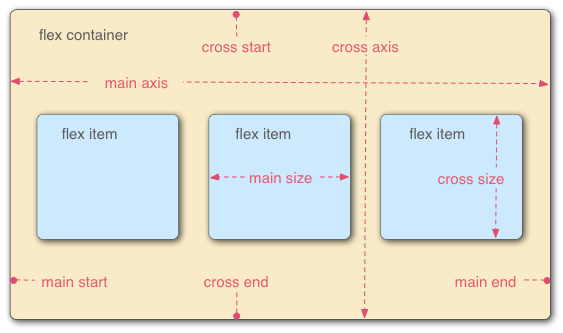
main axis指排列 elements 的方向,cross axies则是垂直于 main axis 的方向,它们都有对应的 start,end.flex item还有对应的 size.
默认 main axis 是 row,我们可以修改:
 {
  flex-direction: column;
}
我们同时还可以使用row-reverse and column-reverse交换 start,end.
如果flex item有固定的大小,可能导致内容超出 container,此时我们可以使用:
 {
  flex-wrap: wrap;
}
这样多出的会放到下一行或下一列.
上述两个 properties 有一个 shorthand property:
 {
  flex-flow: row wrap;
}
我们可以灵活地控制flex item的大小:
article {
  flex: 1;
}
该值代表里面的flex item相对于其他的flex item的大小,如果我们此时:
article:nth-of-type(3) {
  flex: 2;
}
这样第三个flex item会是前两个的两倍大小.
我们还可以设置最小的大小:
article {
  flex: 1 200px;
}

article:nth-of-type(3) {
  flex: 2 200px;
}
这样,flex item首先会是 200px,然后再根据其他的flex item决定是否增加.
flex实际是一个 shorthand property,我们上面提到的两个 property 是flex-grow和flex-basis,它还有一个flex-shrink,放在第二位,值也是一个无单位的数.它是指如果 container 放不下时flex item会缩减到其他的多少以避免溢出.
我们推荐使用 shorthand property.
我们还可以安排flex items的位置:
div {
  display: flex;
  align-items: center;
  justify-content: space-around;
}
align-items安排它们在 cross axis 的位置,默认是stretch,即填满.center指的是保持原来的大小的同时放中间.
除此之外还有flex-start,flex-end等值放在 start 或 end 位置.
justify-content控制它们在 main axis 的位置,默认是flex-start,除此之外还有flex-end,center等值同上.
space-around则是在每一个 flex item 的附件添加一些空白,包括头尾,space-between则只在 flex items 之间添加空白,不包括头尾.
我们还可以安排flex item的顺序:
button:first-child {
  order: 1;
}
order的默认值是 0,越高则会排得越后,它可以是负值.当值相同时,按 html 源代码的顺序排列.
flexbox 可嵌套.
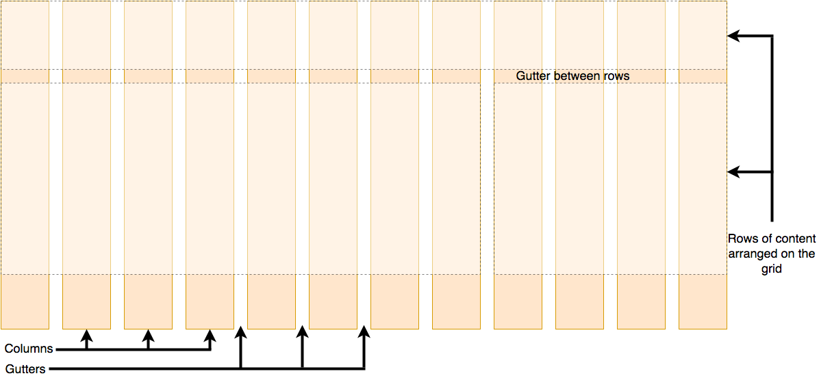
grids
grids 是一种二维的 layout.它有行和列,行或列之间的空格被称为gutter.
它的使用如下:
.container {
  display: grid;
  grid-template-columns: 200px 200px 200px;
}
默认情况下它的表现和 normal flow 一致,所以我们使用grid-template-columns为它创建列,它的值可以是百分比,带单位的数.对于 grids,有一个特殊的单位叫fr指 grid container 的可用空间的一份:
.container {
  display: grid;
  grid-template-columns: 1fr 1fr 1fr;
}
这样可自动安排大小.
然后我们可以在行列间添加空白:
.container {
  display: grid;
  grid-template-columns: 2fr 1fr 1fr;
  gap: 20px;
}
使用 repeat 函数简化书写:
.container {
  display: grid;
  grid-template-columns: repeat(3, 1fr);
  gap: 20px;
}
上面的 gap 是 column-gap 和 row-gap 的 shorthand property.
grid 有explicit grid和implicit grid之分,explicit grid指我们给定大小模板的 grid,implicit grid则是与模板垂直的 grid,即我们给定了行的话,列就是explicit grid.
默认情况下它会按内容的大小自动分配,不过我们也可以指定大小:
.container {
  display: grid;
  grid-template-columns: repeat(3, 1fr);
  grid-auto-rows: 100px;
  grid-gap: 20px;
}
我们可以使用minmax函数指定最大最小:
.container {
  display: grid;
  grid-template-columns: repeat(3, 1fr);
  grid-auto-rows: minmax(100px, auto);
  gap: 20px;
}
其中 auto 指最大值按内容自动指定,这样该函数就变成了指定最小值的函数.
如果我们想得到尽可能多的列,可在 repeat 函数中使用auto-fill:
.container {
  display: grid;
  grid-template-columns: repeat(auto-fill, minmax(200px, 1fr));
  grid-auto-rows: minmax(100px, auto);
  gap: 20px;
}
当我们想处理 grid container 中的 element 的位置时,我们可以使用line-based placement,即通过 grid 的线来安排,grid 的线从 1 开始,根据 writing mode 的方向从 start 到 end.
header {
  grid-column: 1 / 3;
  grid-row: 1;
}

article {
  grid-column: 2;
  grid-row: 2;
}

aside {
  grid-column: 1;
  grid-row: 2;
}

footer {
  grid-column: 1 / 3;
  grid-row: 3;
}
其中 grid-column 是grid-column-start和grid-column-end的 shorthand property,另一个同理.这样如 header 就会从第一条线到第三条线,注意使用时用/分隔.
我们可以使用负数,这样指从 end 开始算线.
我们也可以使用grid-template-areas来安排位置:
.container {
  display: grid;
  grid-template-areas:
    "header header"
    "sidebar content"
    "footer footer";
  grid-template-columns: 1fr 3fr;
  gap: 20px;
}

header {
  grid-area: header;
}

article {
  grid-area: content;
}

aside {
  grid-area: sidebar;
}

footer {
  grid-area: footer;
}
这样的话就会按上述字符串中安排的位置一样安排了.
使用时注意:
- 我们必须写满每一个位置,重复也得写.
- 空的用
.表示. - 它必须是一个长方形.
- 不能在两个方向上重复.
floats
float用于将某个 element 移出 normal flow,然后放在另一个 element 之上,该 element 的内容环绕它(类似报纸的环绕字)。
使用:
.box {
  float: left;
}
这样该 element 就会在左边被环绕,值也可以是right.
注意由于该 element 在 normal flow 外,其他 element 的 margin 等不会对它有影响.
如果我们不想让某一个 element 环绕它,此时我们使用clear:
.cleared {
  clear: left;
}
它有三个值:
left: Clear items floated to the left.right: Clear items floated to the right.both: Clear any floated items, left or right.
有时会出现父 element 的 background 颜色等无法覆盖 float:
<div class="wrapper">
  <div class="box">Float</div>
  <p>
    Lorem ipsum dolor sit amet, consectetur adipiscing elit. Nulla luctus
    aliquam dolor, eu lacinia lorem placerat vulputate.
  </p>
</div>
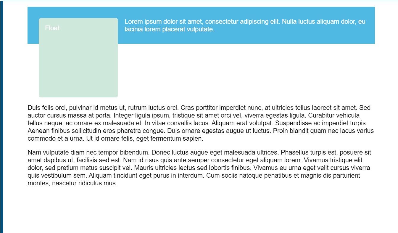
此时有三种解决方案:
1.在之后加点内容后 clear(the clearfix hack):
.wrapper {
  background-color: rgb(79, 185, 227);
  padding: 10px;
  color: #fff;
}
.wrapper::after {
  content: "";
  clear: both;
  display: block;
}
2.使用overflow:
.wrapper {
  background-color: rgb(79, 185, 227);
  padding: 10px;
  color: #fff;
  overflow: auto;
}
3.使用flow-root(较新的方法):
.wrapper {
  background-color: rgb(79, 185, 227);
  padding: 10px;
  color: #fff;
  display: flow-root;
}
positioning
positioning会将 element 弄出 normal flow 再进行处理.默认情况下它的值是:
.positioned {
  position: static;
  background: yellow;
}
此时会将它放在它在 normal flow 的位置,故没有变化.
如果改成relative:
 {
  position: relative;
}
此时还是没有改变,但如果再添加:
 {
  top: 30px;
  left: 30px;
}
此时便会到原来位置的右下角.注意 top(left,right 等同理)对应向下,这有点反直觉.
我们还可以使用absolute:
 {
  position: absolute;
}
此时它会完全从 normal flow 剥离,你会发现原来属于它的位置不再有空白,完全消失.此时添加top等将会让它相对于它的 container block 移动.即 top 则为相对 top 移动多少.
如果它的父 element 修改 position,它会相对于 initial containing block(即整个 html 的 layout)移动.
如果想让它相对于某个父 element 移动,对该 element 修改:
div {
  position: relative;
}
这样它就会相对它进行移动了.
当发生 element 重叠时,我们我们希望改变它们重叠的持续,我们使用z-index:
 {
  z-index: 1;
}
z 轴可看作从屏幕到人脸的一个坐标轴,故值越大越上.
默认情况下值为auto,此时 positioned element 会在上,且在源代码较后的 positioned element 在上.
它的值必须不带单位.
position 的另一个值fixed可让 element 从根据可看见的 viewport 显示,这常被用于制作网页导航栏等需要一直显示的 element.
h1 {
  position: fixed;
  top: 0;
  width: 500px;
  margin-top: 0;
  background: white;
  padding: 10px;
}
sticky则会将 element 在未显示时表现得像 relative 一样,等它显示并到一定位置时,就固定在 viewport 中.这是一个较新的 value.
multiple-column layout
用于将内容自动分页,生成多列的布局。
我们可以用column-count直接指定列数:
.container {
  column-count: 3;
}
也可以通过column-width指定列的宽度:
.container {
  column-count: 3;
}
注意此时多余的空间会自动填充在列之间形成空白.
对于列的修改,我们只能修改列间空白的大小(column-gap)和列的样式(column-rule):
.container {
  column-count: 3;
  column-gap: 20px;
  column-rule: 4px dotted rgb(79, 185, 227);
}
其中列的样式类似border,只是不占有自己空间.
我们可以让某个 element 在中间隔开列,形成两边各一部分的列:
 {
  column-span: all;
}
注意此时上面的 element 的内容形成自己的多列,下面的同上.
有时列对内容的分隔将原本完整的内容分成两个部分,影响观看,此时可以使用css fragmentation的相关 properties:
.card {
  break-inside: avoid;
}
这样就不会让完整的内容分隔了.
responsive design
现在移动设备的盛行导致屏幕尺寸已经多样到无法一个个做一个网页适配的情况,于是有了responsive design,即根据屏幕大小自动适应的一类技术.
它是由三个主要的技术组成:
- fluid grids.
- fluid images
- media query,即判断屏幕尺寸并选择相应的 css properties.
使用如下:
@media screen and (min-width: 800px) {
  .container {
    margin: 1em 2em;
  }
}
这样会在判断屏幕在满足一定条件时应用.
有时我们会想设计一个单列的小网页,然后再考虑大尺寸时的多列网页,这种设计思想叫mobile first design.
当我们为多个屏幕尺寸安排字体大小时,我们可以使用vw等单位实现一次安排:
h1 {
  font-size: calc(1.5rem + 3vw);
}
注意不能单独使用,不如会导致无法放大缩小.
一般我们会在 html 的头部添加:
<meta name="viewport" content="width=device-width,initial-scale=1" />
这用于告诉手机浏览器给真实的屏幕尺寸,早期的手机浏览器会给一个大尺寸让大尺寸网页显示然后让用户滚动查看.
media query
一个基础的media query的格式如下:
@media media-type and (media-feature-rule) {
  /* CSS rules go here */
}
media-type指平台的类型,它是可选的,它有以下的值:
allprintscreenspeech
对于media-feature-rule,可以使用 width,max-width,height 等 css 的相关 properties:
@media screen and (width: 600px) {
  body {
    color: red;
  }
}
也可以使用orientation的 portrait 和 landscape 来选择移动设备的横向或纵向显示:
@media (orientation: landscape) {
  body {
    color: rebeccapurple;
  }
}
对于可点击的设备,我们可以这样:
@media (hover: hover) {
  body {
    color: rebeccapurple;
  }
}
这样来指定一个设备是否可以使用鼠标的功能.
更进一步还有 pointer media feature. 有三个值: none, fine and coarse. fine 指和鼠标或触控板一样可以进行悬停等操作,coarse 指手指操作,none 表示没有相关的设备,可能只使用键盘.
还可以使用相关的逻辑:
与:
@media screen and (min-width: 600px) and (orientation: landscape) {
  body {
    color: blue;
  }
}
或
@media screen and (min-width: 600px), screen and (orientation: landscape) {
  body {
    color: blue;
  }
}
非(针对 media feature)
@media not all and (orientation: landscape) {
  body {
    color: blue;
  }
}
legacy layout methods
过去没有 grid layout,为了实现人们使用了很多方法,虽然现在已经有了,但在较旧的网站那些方法依然在使用,故需要了解相关的方法.
我们可以通过 class 进行操作:
<div class="wrapper">
  <div class="row">
    <div class="col">1</div>
    <div class="col">2</div>
    <div class="col">3</div>
    <div class="col">4</div>
    <div class="col">5</div>
    <div class="col">6</div>
    <div class="col">7</div>
    <div class="col">8</div>
    <div class="col">9</div>
    <div class="col">10</div>
    <div class="col">11</div>
    <div class="col">12</div>
  </div>
  <div class="row">
    <div class="col span1">13</div>
    <div class="col span6">14</div>
    <div class="col span3">15</div>
    <div class="col span2">16</div>
  </div>
</div>
然后添加一些基础的 properties.
* {
  box-sizing: border-box; /*便于计算width*/
}

body {
  width: 980px;
  margin: 0 auto;
}

.wrapper {
  padding-right: 20px;
}
然后添加让每一行独立出来.
.row {
  clear: both;
}
然后创建具体的 grid 的某一块:
.col {
  float: left;
  margin-left: 20px;
  width: 60px;
  background: rgb(255, 150, 150);
}
占据多列:
/* Two column widths (120px) plus one gutter width (20px) */
.col.span2 {
  width: 140px;
}
/* Three column widths (180px) plus two gutter widths (40px) */
.col.span3 {
  width: 220px;
}
/* And so on... */
我们可以看出其实就是计算具体的宽度然后一个个安排.但有具体的长宽不利于适应屏幕,我们可以计算比例:
target / context = result
如上面的 gutter 为 20px,整个容器的大小为 960px,故为:
20 / 960 = 0.02083333333
通过这样的方式将上面的代码的长度转化为比例.
我们还可以调用calu():
.col.span2 {
  width: calc((6.25% * 2) + 2.08333333%);
}
.col.span3 {
  width: calc((6.25% * 3) + (2.08333333% * 2));
}
.col.span4 {
  width: calc((6.25% * 4) + (2.08333333% * 3));
}
如果有个地方我们希望是空白,我们也需要添加对于的类(即增加 margin):
.offset-by-one {
  margin-left: 10.41666666%;
}
利用 float 形成 grid 是有问题的,column 太宽可能导致形成多行,内容太多可能导致 overflow,且我们无法对行的大小进行操作.
我们也可以使用flexbox来写 grid layout,它相对于 float 会较简便,但基本的思想是一样的.但写时需要时刻注意,它是一个一维的 layout,不可能完美.而且 flexbox 的在旧浏览器的支持不如 float.
网上还有很多第三方的 css grid framework(如Skeleton website),使用它们可以简便我们的工作.
supporting older browsers
对于老的不支持 grid 或 flex 等 layout 的浏览器,我们可以利用 fallback 给它们.核心思想是浏览器会忽略掉无法使用的 css properties,且以下 properties 在 grid,flex 中会失效:
1.Float and clear
2.display: inline-block
3.display: table
4.Multiple-column Layout
5.Flexbox as a Fallback for Grid
这样我们可以写两个版本的 css.
但有一个问题是 width 等性质仍会应用,这会导致问题,我们可以使用feature query:
@supports (display: grid) {
  .item {
    width: auto;
  }
}
这样它会检查是否支持后再应用.注意它是一个较新的规则,故最好让它检查浏览器是否支持现代 layout.
当日最重要的是我们要写一个一开始就组织好的 html 文件,这样即使不支持相关的 layout 也可使用.
在 IE 的有些版本中对 grid 有过短暂的支持(注意 edge 也支持,所以可能出问题),但需要加类似-ms-的前缀.这个只有在需要支持该版本的 IE 的大量用户时才会使用,故只需做了解.
style form
base
以前对 form 进行样式修改很困难,现在已经相对简单了,但还是有很多需要注意的点。 和其他的 element 基本一样修改的:
<form><fieldset>and<legend>.- Single-line text
<input>s (e.g. type text, url, email...), except for<input type="search">. - Multi-line
<textarea> - Buttons (both
<input>and<button>) <label><output>
注意<input type='submit'>若修改字体它仍会是系统的字体,故使用button更佳. 不同的 control 安排 padding 等属性的规则不同,使用box-sizing统一设置为border-box. legend的位置修改需要使用position.
较难修改的:
- Checkboxes and radio buttons
<input type="search">
不可以用 css 修改的:
<input type="color">- Date-related controls such as
<input type="datetime-local"> <input type="range"><input type="file">- Elements involved in creating dropdown widgets, including
<select>,<option>,<optgroup>and<datalist>. <progress>and<meter>
bad and ugly
对于 bad(较难修改),我们通常会使用(appearance:none)来取消默认样式,然后再进行修改. 对于 ugly(无法修改),最后还是建立一个自己的 control 来替换.
pseudo class
对所有 form control 都起作用的:
:hover: 当被鼠标悬停时匹配.:focus: 当被 focus(如通过 tab 键)时匹配.:active: 当 actived(点击或按下 enter/return 键)时匹配. 还有一些特殊的::requiredand:optional: 当 control 是必须的(有required属性)时时匹配第一个,否则是第二个.注意如果多个 name 属性相同的 radio 中有一个有required,它们在未选中时都是非法的,但只有那个有required的会匹配.:validand:invalid, and:in-rangeand:out-of-range:验证数据时是否符合规范匹配第一个和第一二,数字类型的 control(日期类,number,range)是否在 min 和 max 设定的数字范围内匹配第三第四个.:enabledand:disabled, and:read-onlyand:read-write: 是否可用(有无disable)匹配前两个,是否只读(有readonly)匹配后两个.:checked,:indeterminate, and:default: 对于 checkbox 和 radio buttons,被选中时匹配第一个,还未选择时匹配第二个,默认值匹配第三个(注意即使不选中了也会匹配). 对于何时匹配indeterminate有如下规则:<input/radio>当同个name属性的一组 radio 没有一个被选中时.<input/checkbox>通过 js 将indeterminateproperty 设未 true 时.<progress>没有值时. 除此之外还有一些浏览器支持没有那么好的::focus-within当它被 focus 它的子 element 被 focus 时匹配.:focus-visible通过键盘 focus 时匹配.- The
:placeholder-shown<input>和<textarea>的 placeholder 显示时(即值未空且有 placeholder 设定)匹配.
others
animation
使用 css 动画有以下优点:
- 使用简易.
- 表现良好.
- 浏览器可控制,便于优化性能表现. css 动画的核心是
animation相关 properties 和@keyframes. 相关 properties:animation-name
在@keyframes中的名字.
动画一次循环的时长.
控制动画途中如何进行.
element 加载到动画开始的时长.
动画重复次数,可通过 infinite 设置为无限循环.
设置动画在循环中再次开始时的方向.
在执行动画前后是否应用动画使用的 style,默认都不应用.
控制动画的开始暂停.
例子:
p {
  animation-duration: 3s;
  animation-name: slidein;
}

@keyframes slidein {
  from {
    margin-left: 100%;
    width: 300%;
  }

  75% {
    font-size: 300%;
    margin-left: 25%;
    width: 150%;
  }

  to {
    margin-left: 0%;
    width: 100%;
  }
}
其中是from,to是0%和100%的同义词. 该动画会有字变大又变小的效果.在@keyframes中如果我们没有写相关的 property 的值,则它们会是相关 element 的对于 property 的值,动画依此产生. animation可以写成 shorthand 形式,不过写成 longhand 时我们可以写多个值(逗号分隔),那些值会一一对应:
animation-name: fadeInOut, moveLeft300px, bounce;
animation-duration: 2.5s, 5s, 1s;
animation-iteration-count: 2, 1, 5;
/*bounce-1s-5*/
如果值的数量不同,较少的被循环利用:
animation-name: fadeInOut, moveLeft300px, bounce;
animation-duration: 2.5s, 5s;
animation-iteration-count: 2, 1;
/*bounce-2.5s-2*/
transition
transition用于控制 css properties 变换时的动画. 有如下的 properties 用于控制: transition-property
标明值变化时要应用动画的 properties.
动画执行时长.
指定一个函数用于控制 properties 中间值的生成.
指定 property 值变化与动画开始之间的时间.
shorthand:
div {
  transition: <property> <duration> <timing-function> <delay>;
}
例子:
#delay {
  font-size: 14px;
  transition-property: font-size;
  transition-duration: 4s;
  transition-delay: 2s;
}

#delay:hover {
  font-size: 36px;
}
如果有多个值时,值较少的 property 会被循环使用:
div {
  transition-property: opacity, left, top, height;
  transition-duration: 3s, 5s; /*3,5,3,5*/
}
特别的,如果是 transition-property 较短,其他的 properties 会被缩减. transition 会发出事件便于 js 进行控制:
el.addEventListener("transitionend", updateTransition, true);
el.addEventListener("transitionrun", signalStart, true); //delay前发出
el.addEventListener("transitionstart", signalStart, true); //delay后发出
event object 添加了一些 properties 形成了TransitionEvent object: propertyName
transition 作用的 css property 名
elapsedTime
当事件发出时动画已经执行的时长.
scroll snap
scroll snap可让用户滚动时快速滚动到指定位置,形成类似翻页的效果. 它的核心是scroll-snap-type 和 scroll-snap-align. 例子:
<article class="scroller">
  <section>
    <h2>Section one</h2>
  </section>
  <section>
    <h2>Section two</h2>
  </section>
  <section>
    <h2>Section three</h2>
  </section>
</article>
.scroller {
  height: 300px;
  overflow-y: scroll;
  scroll-snap-type: y mandatory;
}

.scroller section {
  scroll-snap-align: start;
}
其中 y 指的是会发生快速滚动的方向,mandatory指强制发生快速滚动,它还有另外一个可用值proximity,此时只会在接近时发生快速滚动. scroll-snap-align的start指的是滚动后停下的在 section 中的位置(其他 element 也可).除此之外还有end,center. scroll-padding和scroll-margin用于定义停下时的 scroll container 的 padding 和或子 element 的 margin.显示效果是未翻整页.在前者.scroller中使用,后者在子 element 中使用,故后者可有不同值.
transform
transform可在不影响 normal flow 的情况下改变 element 的形状和位置.它只对符合 box model(display:block)的 element 起作用. 主要的 properties 有两个: transform-origin
设置原点(默认是中心).如旋转时设置 bottom left 按左下点进行旋转.
指定改变的类型,可同时执行多个.改变的类型有 rotation, skewing, scaling, 和 translation(平移).它们均可在 x,y 上进行(如 translateX(2px)). 也可以在进行 3d 的变换,不过需要指定perspective.
calc
calc 加使用+,-运算符必须在运算符的两边加上空格.
一些建议
1.保持命名风格等持续.
2.加适量的空格增加可读性
3.添加适量的注释
4.将文件分为多个 logic section 并用注释分隔.
5.避免使用太特殊的 selector
6.将大的 css 文件分为多个小 css 文件
logic section 的分隔注释如下:
/* || GENERAL STYLES */
一般可分为四个 section.
- general styles,即一般的样式
- utility,即各种有用的类
- sitewide,所有需要在网站内用的东西,如 nav.
- 最后在添加一些特殊的东西
还有一些其他的工具.
css methodologies,即书写 css 代码的风格方法,广泛使用的有如 BEM,OOCSS.
还有 pre-processor,可生成 stylesheet,有名的有 spass,post-processor,可处理 stylesheet.
这些在使用了 css in js 和现代 css 后都不再被使用,但了解一下依然是不错的选择.